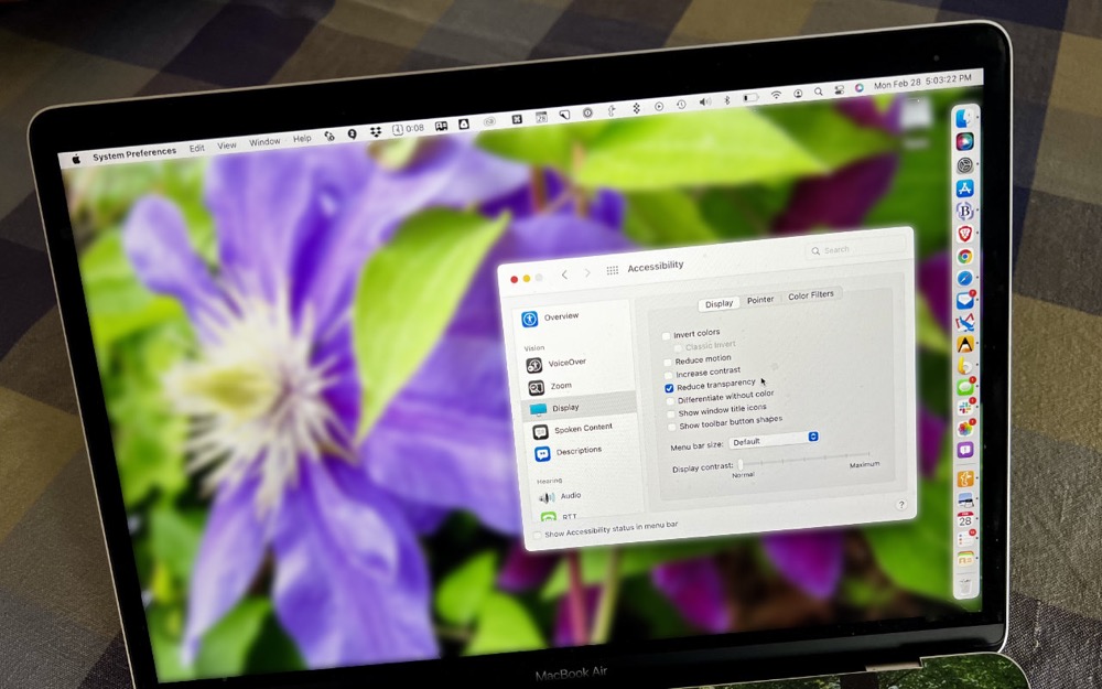

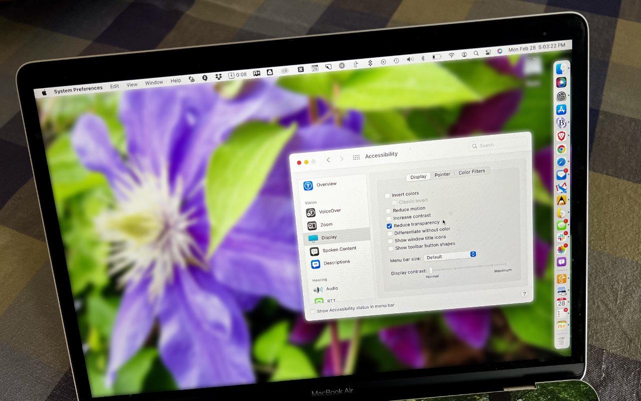
For years now, Apple has made transparency a part of the macOS interface, which has the effect of blending the menu bar into the background and making menus and some windows take on the background hue, as you can see on the left side of the illustration below. For many people, transparency blurs the interface, making it harder to differentiate interface elements from the wallpaper. It also causes problems for screenshots meant for publication because the images end up with unrepresentative color levels. To prevent that from happening, open System Preferences > Accessibility > Display and select Reduce Transparency. It can be a significant difference, as you can see on the right side of the illustration below.
AI Usage Transparency Report
Pre-AI Era · Written before widespread use of generative AI tools
AI Signal Composition
Score: 0.02 · Low AI Influence
Summary
For years now, Apple has made transparency a part of the macOS interface...
Related Posts
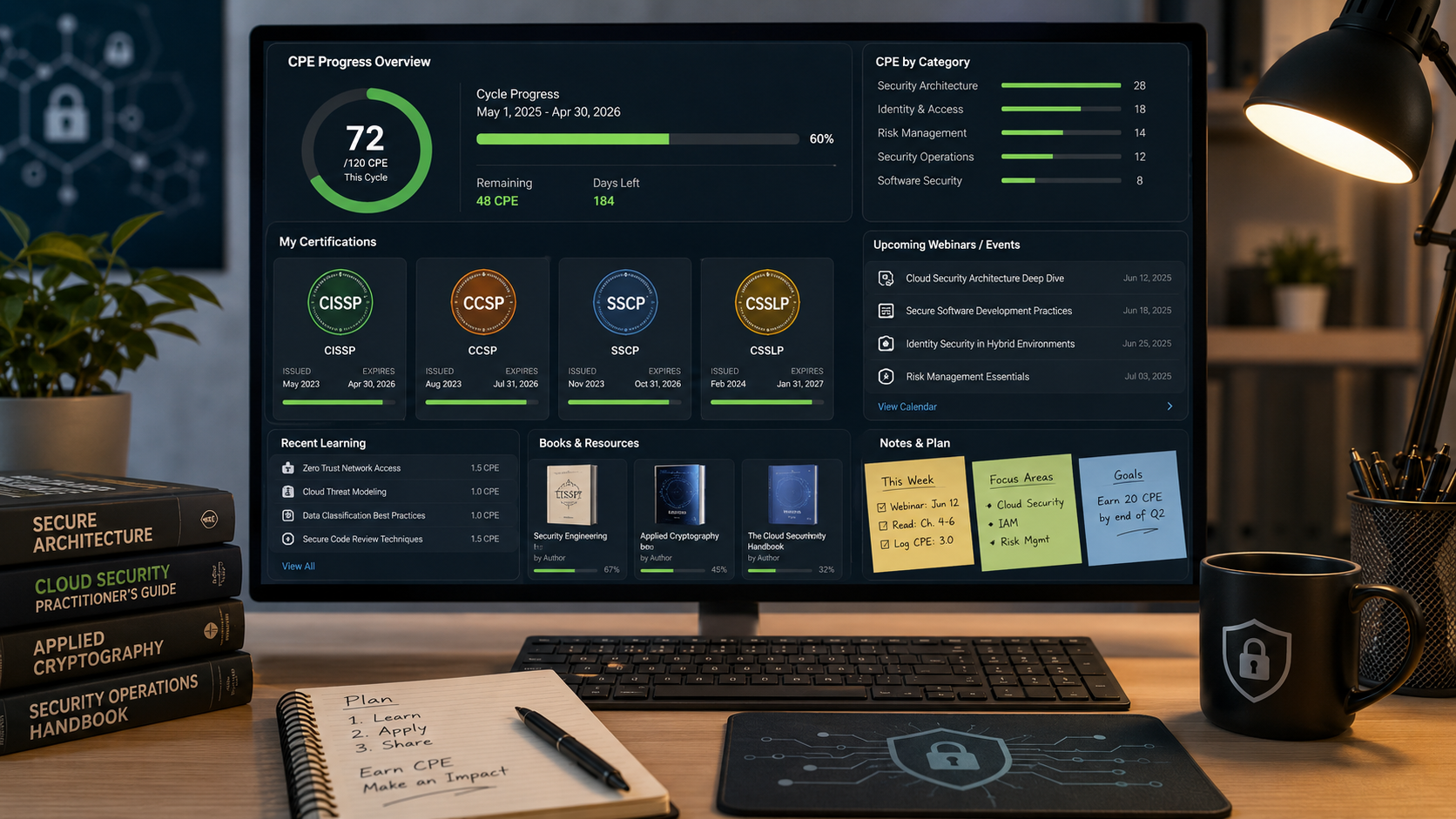
How I Keep Up With ISC2 CPE Credits Without Making It a Second Job
Keeping up with ISC2 CPE credits is easier when you treat it like a normal professional habit instead of a renewal emergency. Here is the system I use across CISSP, CCSP, SSCP, and CSSLP, with free and low-friction sources for webinars, books, training, and work-based credits.
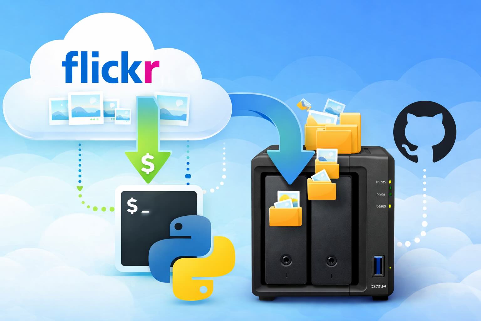
Leaving Flickr: Migrating 20,000+ Photos to Synology and Taking Back Control
There’s a certain kind of friction you start to notice when you’ve been using a service for a long time. Not enough to make you leave immediately, but enough to make you pause. Flickr had been that kind of service for me. It quietly held years of photos, uploads from old phones, albums I hadn’t looked at in ages, and a massive "Auto Upload" collection that had grown into something I didn’t fully understand anymore.
How I Finally Passed the PMP Exam (After 12 Years of Waiting)
Back in 2013, I registered for a PMI membership with every intention of pursuing my PMP certification. I downloaded the handbook, bookmarked the eligibility requirements, and even told a few friends that I was going to do it "soon." At the time, I thought getting certified would be a straightforward process, but little did I know what lay ahead in terms of studying and preparation.
10 Things You Didn't Know You Could Do With Apple Configurator (That Save Mac Admins Hours)
Most of us treat Apple Configurator like a fire extinguisher: break glass, DFU, restore, move on. But it can do a lot more, and when you know the edges, you can turn a bricked morning into a ship-it afternoon. Below are ten things I regularly use (or wish I’d used sooner) that demonstrate its capabilities beyond just emergency recovery.
The Evolution of Apple Certification: A Journey Through Versions, Challenges & Growth
When I recently passed the Apple Certified Support Professional (ACSP) exam again, I paused to reflect — not just on this milestone, but on the long path I’ve walked through Apple’s certification landscape. My first certification dates back to macOS 10.5, and over the years, I’ve earned credentials across nearly every version since. In that time, the exams — and Apple itself — have transformed significantly.

Secure Software, Secure Career: How I Passed the CSSLP
After passing the CISSP earlier this year, I decided to follow it up with the **Certified Secure Software Lifecycle Professional (CSSLP)** certification. For those unfamiliar, CSSLP is an ISC2 certification that focuses specifically on secure software development practices across the full SDLC—from requirements and design to coding, testing, deployment, and maintenance. My goal in pursuing this certification was to further develop my skills in ensuring the security of software throughout its entire lifecycle.
Managing Bring Your Own Device (BYOD) for Android with Microsoft Intune
Alright, so today we're going to be talking about the management of bring your own device BYOD for Android devices. There's a lot of information out there for the management of iOS devices and you can do that with pretty much any Apple MDM on the market. We just happen to use Jamf where I work, but you could use anything from Braavos to SimpleMDM to Kanji or JumpCloud. Mosyle is also a great option.

BYO with me in 2025: iOS with User Enrollment in JAMF Pro
It really depends on your company's needs. For example, many companies need to hire 1099 contractors and in such a case they come with their own devices but not the correct security settings or enforcements. Remember BYOD is a security construct. The idea here is that you should be securing the company's sensitive data in all forms. This may involve implementing policies for contractor-owned devices, ensuring that all devices accessing company data meet minimum security standards, and regularly reviewing and updating these standards to stay ahead of emerging threats.

Securing BYOD Email Access: Exploring Strategies in Microsoft 365
In today’s mobile-first world, organizations increasingly rely on Bring Your Own Device (BYOD) programs to empower employees while optimizing costs. However, this flexibility introduces unique challenges, particularly around securing email access. To mitigate risks, we are implementing a comprehensive strategy to block email access on non-company devices by default and ensure only sanctioned apps can access organizational email accounts. This approach will help prevent unauthorized access and data breaches, aligning with our commitment to maintaining the security and integrity of company communications.
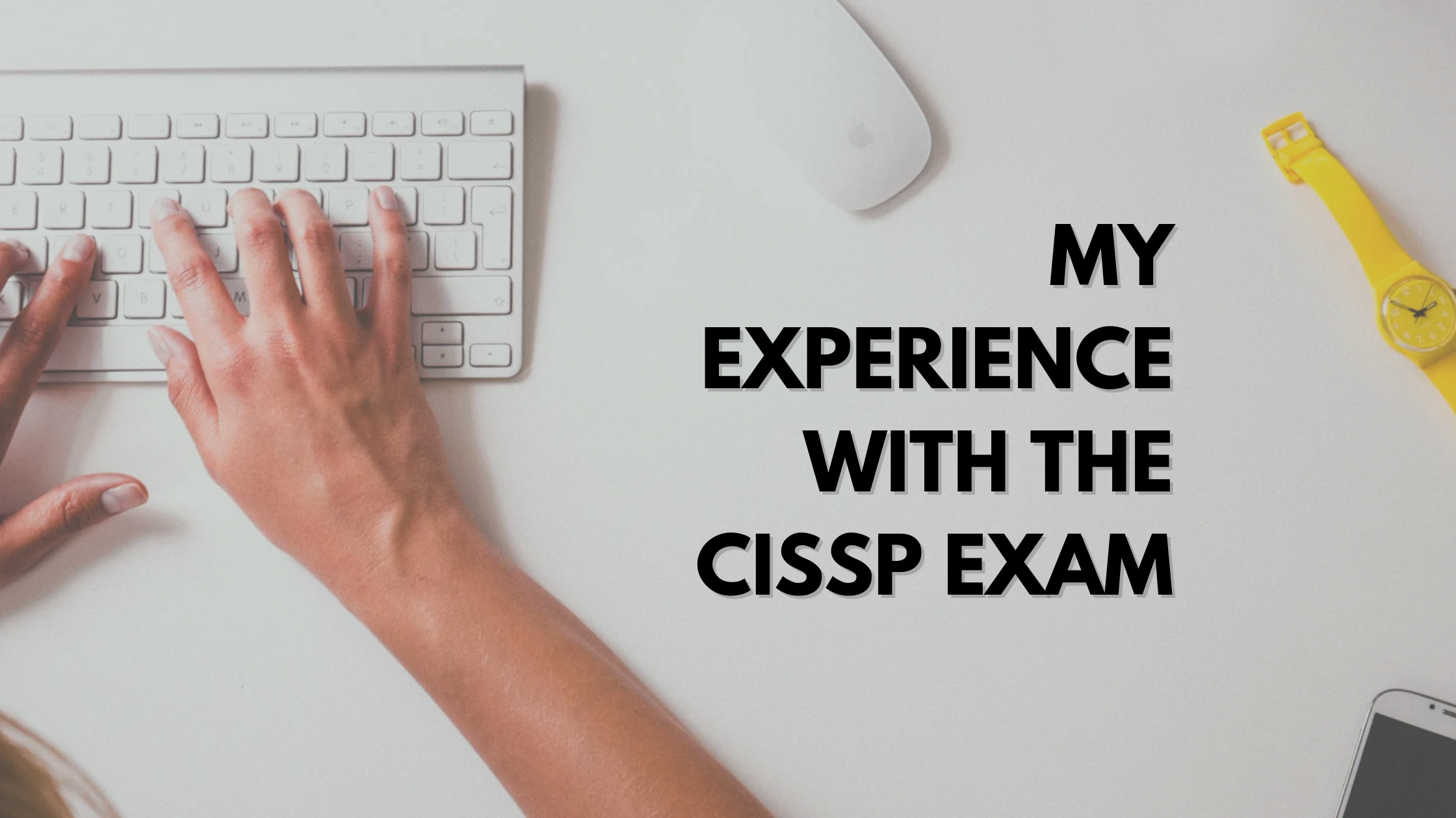
How I Conquered the CISSP Exam: 9 Months, Top Resources, and Proven Strategies
Passing the CISSP (Certified Information Systems Security Professional) exam is no small feat. It’s known for its breadth, depth, and ability to test not just your knowledge but your practical understanding of cybersecurity. After nine months of intense preparation, I’m thrilled to say I’ve joined the ranks of CISSP-certified professionals! Here's a detailed account of my experience, including the resources I used, some tips that helped me along the way, and what I learned from the process itself.
